BRANDING, WEBSITE & ADVERTISING
Old Second
National Bank
Even with more than 150 years of serving the Chicagoland area, Old Second National Bank simply wasn’t standing out. In fact, area locals commonly confused it with the much larger financial institution, Old National.
HERE, YOU'RE FIRST.
More than just a fresh new look, We gave the bank’s name new meaning. Now customers know exactly where they stand in the relationship. Every day and in every way, Old Second is putting their customers first.
LOGO REFRESH
—
The old logo mark didn’t need a complete overhaul, but the refresh helped to better represent the bank’s mission. Much like their relationships with customers, the new logo is more connected and balanced, creating a sense that one begins where the other ends.
WEBSITE
—
The new branding really came to life through a high-level site refresh. Along with new design elements, color palette and updated imagery, a far more customer-centric voice guides users throughout the online experience.


GETTING THE WORD OUT
—
Current customers were loving the new branding, but it was time to get new customers coming through the doors. So beyond two highly effective brand TV spots, we extended the vibrant new ad campaign online and on the road.


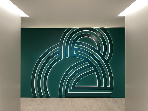
SIGNAGE
—
Whether retrofitting existing structures or updating legacy branches with custom signage, we made sure to show the clean new branding in its very best light.


IN-BRANCH SCREENS
—
While customers await the next available teller, they’re kept company with warm, branded messaging about how we’re here to support their success and happiness.
IN-BRANCH COLLATERAL
—
From a crisp new stationery system to helpful product brochures to thoughtful touches, we crafted a branch experience as welcoming as the Old Second team.


